
A | B | C | D | E | F | G | H | CH | I | J | K | L | M | N | O | P | Q | R | S | T | U | V | W | X | Y | Z | 0 | 1 | 2 | 3 | 4 | 5 | 6 | 7 | 8 | 9
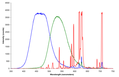
A set of primary colors or primary colours (see spelling differences) consists of colorants or colored lights that can be mixed in varying amounts to produce a gamut of colors. This is the essential method used to create the perception of a broad range of colors in, e.g., electronic displays, color printing, and paintings. Perceptions associated with a given combination of primary colors can be predicted by an appropriate mixing model (e.g., additive, subtractive) that reflects the physics of how light interacts with physical media, and ultimately the retina. The most common color mixing models are the additive primary colors (red, green, blue) and the subtractive primary colors (cyan, magenta, yellow).
Primary colors can also be conceptual (not necessarily real), either as additive mathematical elements of a color space or as irreducible phenomenological categories in domains such as psychology and philosophy. Color space primaries are precisely defined and empirically rooted in psychophysical colorimetry experiments which are foundational for understanding color vision. Primaries of some color spaces are complete (that is, all visible colors are described in terms of their primaries weighted by nonnegative primary intensity coefficients) but necessarily imaginary[1] (that is, there is no plausible way that those primary colors could be represented physically, or perceived). Phenomenological accounts of primary colors, such as the psychological primaries, have been used as the conceptual basis for practical color applications even though they are not a quantitative description in and of themselves.
Sets of color space primaries are generally arbitrary, in the sense that there is no one set of primaries that can be considered the canonical set. Primary pigments or light sources are selected for a given application on the basis of subjective preferences as well as practical factors such as cost, stability, availability etc.
The concept of primary colors has a long, complex history. The choice of primary colors has changed over time in different domains that study color. Descriptions of primary colors come from areas including philosophy, art history, color order systems, and scientific work involving the physics of light and perception of color.
Art education materials commonly use red, yellow, and blue as primary colors, sometimes suggesting that they can mix all colors. No set of real colorants or lights can mix all possible colors, however. In physics, the three primary colors are typically red, green and blue, after the different types of photoreceptor pigments in the cone cells.[2][3]
Color model primaries
A color model is an abstract model intended to describe the ways that colors behave, especially in color mixing. Most color models are defined by the interaction of multiple primary colors. Since most humans are trichromatic, color models that want to reproduce a meaningful portion of a human's perceptual gamut must use at least three primaries.[4] More than three primaries are allowed, for example, to increase the size of the gamut of the color space, but the entire human perceptual gamut can be reproduced with just three primaries (albeit imaginary ones as in the CIE XYZ color space).
Some humans (and most mammals[5]) are dichromats, corresponding to specific forms of color blindness in which color vision is mediated by only two of the types of color receptors. Dichromats require only two primaries to reproduce their entire gamut and their participation in color matching experiments was essential in the determination of cone fundamentals leading to all modern color spaces.[6] Despite most vertebrates being tetrachromatic,[7] and therefore requiring four primaries to reproduce their entire gamut, there is only one scholarly report of a functional human tetrachromat, for which trichromatic color models are insufficient.[8]
Additive models


The perception elicited by multiple light sources co-stimulating the same area of the retina is additive, i.e., predicted via summing the spectral power distributions (the intensity of each wavelength) of the individual light sources assuming a color matching context.[9]: 17–22 For example, a purple spotlight on a dark background could be matched with coincident blue and red spotlights that are both dimmer than the purple spotlight. If the intensity of the purple spotlight was doubled it could be matched by doubling the intensities of both the red and blue spotlights that matched the original purple. The principles of additive color mixing are embodied in Grassmann's laws.[10] Additive mixing is sometimes described as "additive color matching"[11] to emphasize the fact the predictions based on additivity only apply assuming the color matching context. Additivity relies on assumptions of the color matching context such as the match being in the foveal field of view, under appropriate luminance, etc.[12]
Additive mixing of coincident spot lights was applied in the experiments used to derive the CIE 1931 colorspace (see color space primaries section). The original monochromatic primaries of the wavelengths of 435.8 nm (violet), 546.1 nm (green), and 700 nm (red) were used in this application due to the convenience they afforded to the experimental work.[13]
Small red, green, and blue elements (with controllable brightness) in electronic displays mix additively from an appropriate viewing distance to synthesize compelling colored images. This specific type of additive mixing is described as partitive mixing.[9]: 21–22 Red, green, and blue light are popular primaries for partitive mixing since primary lights with those hues provide a large color triangle (gamut).[14]
The exact colors chosen for additive primaries are a compromise between the available technology (including considerations such as cost and power usage) and the need for large chromaticity gamut. For example, in 1953 the NTSC specified primaries that were representative of the phosphors available in that era for color CRTs. Over decades, market pressures for brighter colors resulted in CRTs using primaries that deviated significantly from the original standard.[15] Currently, ITU-R BT.709-5 primaries are typical for high-definition television.[16]
Subtractive models


The subtractive color mixing model predicts the resultant spectral power distribution of light filtered through overlaid partially absorbing materials, usually in the context of an underlying reflective surface such as white paper.[9]: 22–23 [17] Each layer partially absorbs some wavelengths of light from the illumination while letting others pass through, resulting in a colored appearance. The resultant spectral power distribution is predicted by the wavelength-by-wavelength product of the spectral reflectance of the illumination and the product of the spectral reflectances of all of the layers.[18] Overlapping layers of ink in printing mix subtractively over reflecting white paper, while the reflected light mixes in a partitive way to generate color images.[9]: 30–33 [19] Importantly, unlike additive mixture, the color of the mixture is not well predicted by the colors of the individual dyes or inks. The typical number of inks in such a printing process is 3 (CMY) or 4 (CMYK), but can commonly range to 6 (e.g., Pantone hexachrome). In general, using fewer inks as primaries results in more economical printing but using more may result in better color reproduction.[20]
Cyan (C), magenta (M), and yellow (Y) are good chromatic subtractive primaries in that filters with those colors can be overlaid to yield a surprisingly large chromaticity gamut.[21] A black (K) ink (from the older "key plate") is also used in CMYK systems to augment C, M and Y inks or dyes due to both being more efficient in terms of time and expense and less likely to introduce visible defects.[22] Before the color names cyan and magenta were in common use, these primaries were often known as blue and red, respectively, and their exact color has changed over time with access to new pigments and technologies.[23] Organizations such as Fogra,[24] European Color Initiative and SWOP publish colorimetric CMYK standards for the printing industry.[25]
Traditional red, yellow, and blue primary colors as a subtractive system
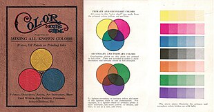

Color theorists since the seventeenth century, and many artists and designers since that time, have taken red, yellow, and blue to be the primary colors (see history below). This RYB system, in "traditional color theory", is often used to order and compare colors, and sometimes proposed as a system of mixing pigments to get a wide range of, or "all", colors.[27] O'Connor describes the role of RYB primaries in traditional color theory:[28]
A cornerstone component of traditional color theory, the RYB conceptual color model underpins the notion that the creation of an exhaustive gamut of color nuances occurs via intermixture of red, yellow, and blue pigments, especially when applied in conjunction with white and black pigment color. In the literature relating to traditional color theory and RYB color, red, yellow, and blue are often referred to as primary colors and represent exemplar hues rather than specific hues that are more pure, unique, or proprietary variants of these hues.
Traditional color theory is based on experience with pigments, more than on the science of light. In 1920, Snow and Froehlich explained:[29]
It does not matter to the makers of dyes if, as the physicist says, red light and green light in mixture make yellow light, when they find by experiment that red pigment and green pigment in mixture produce gray. No matter what the spectroscope may demonstrate regarding the combination of yellow rays of light and blue rays of light, the fact remains that yellow pigment mixed with the blue pigment produces green pigment.
The widespread adoption of teaching of RYB as primary colors in post-secondary art schools in the twentieth century has been attributed to the influence of the Bauhaus, where Johannes Itten developed his ideas on color during his time there in the 1920s, and of his book on color[30][31] published in 1961.[26]
In discussing color design for the web, Jason Beaird writes:[32]
The reason many digital artists still keep a red, yellow, and blue color wheel handy is because the color schemes and concepts of traditional color theory are based on that model. ... Even though I design mostly for the Web—a medium that's displayed in RGB—I still use red, yellow, and blue as the basis for my color selection. I believe that color combinations created using the red, yellow, and blue color wheel are more aesthetically pleasing, and that good design is about aesthetics.
Of course, the notion that all colors can be mixed from RYB primaries is not true, just as it is not true in any system of real primaries.[33] For example, if the blue pigment is a deep Prussian blue, then a muddy desaturated green may be the best that can be had by mixing with yellow.[34] To achieve a larger gamut of colors via mixing, the blue and red pigments used in illustrative materials such as the Color Mixing Guide in the image are often closer to peacock blue (a blue-green or cyan) and carmine (or crimson or magenta) respectively.[34][35][36] Printers traditionally used inks of such colors, known as "process blue" and "process red", before modern color science and the printing industry converged on the process colors (and names) cyan and magenta[34][36] (this is not to say that RYB is the same as CMY, or that it is exactly subtractive, but that there is a range of ways to conceptualize traditional RYB as a subtractive system in the framework of modern color science).
Faber-Castell identifies the following three colors: "Cadmium yellow" (number 107) for yellow, "Phthalo blue" (number 110) for blue and "Deep scarlet red" (number 219) for red, as the closest to primary colors for its Art & Graphic color pencils range. "Cadmium yellow" (number 107) for yellow, "Phthalo blue" (number 110) for blue and "Pale geranium lake" (number 121) for red, are provided as primary colors in its basic 5 color "Albrecht Dürer" watercolor marker set.
Mixing pigments in limited palettes
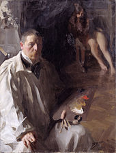
The first known use of red, yellow, and blue as "simple" or "primary" colors, by Chalcidius, ca. AD 300, was possibly based on the art of paint mixing.[38]
Mixing pigments for the purpose of creating realistic paintings with diverse color gamuts is known to have been practiced at least since Ancient Greece (see history section). The identity of a/the set of minimal pigments to mix diverse gamuts has long been the subject of speculation by theorists whose claims have changed over time, for example, Pliny's white, black, one or another red, and "sil", which might have been yellow or blue; Robert Boyle's white, black, red, yellow, and blue; and variations with more or fewer "primary" color or pigments. Some writers and artists have found these schemes difficult to reconcile with the actual practice of painting.[39]: 29–38 Nonetheless, it has long been known that limited palettes consisting of a small set of pigments are sufficient to mix a diverse gamut of colors.[40][41][42][43][44]
The set of pigments available to mix diverse gamuts of color (in various media such as oil, watercolor, acrylic, gouache, and pastel) is large and has changed throughout history.[45][46] There is no consensus on a specific set of pigments that are considered primary colors – the choice of pigments depends entirely on the artist's subjective preference of subject and style of art, as well as material considerations like lightfastness and mixing behavior.[47] A variety of limited palettes have been employed by artists for their work.[48][49]
The color of light (i.e., the spectral power distribution) reflected from illuminated surfaces coated in paint mixes is not well approximated by a subtractive or additive mixing model.[50] Color predictions that incorporate light scattering effects of pigment particles and paint layer thickness require approaches based on the Kubelka–Munk equations,[51] but even such approaches are not expected to predict the color of paint mixtures precisely due to inherent limitations.[52] Artists typically rely on mixing experience and "recipes"[53][54] to mix desired colors from a small initial set of primaries and do not use mathematical modeling.
MacEvoy explains why artists often chose a palette closer to RYB than to CMY:[55]
Because the 'optimal' pigments in practice produce unsatisfactory mixtures; because the alternative selections are less granulating, more transparent, and mix darker values; and because visual preferences have demanded relatively saturated yellow to red mixtures, obtained at the expense of relatively dull green and purple mixtures. Artists jettisoned 'theory' to obtain the best color mixtures in practice.
Color space primaries
A color space is a subset of a color model, where the primaries have been defined, either directly as photometric spectra, or indirectly as a function of other color spaces. For example, sRGB and Adobe RGB are both color spaces based on the RGB color model. However, the green primary of Adobe RGB is more saturated than the equivalent in sRGB, and therefore yields a larger gamut.[63] Otherwise, choice of color space is largely arbitrary and depends on the utility to a specific application.[1]
Imaginary primaries
Color space primaries are derived from canonical colorimetric experiments that represent a standardized model of an observer (i.e., a set of color matching functions) adopted by Commission Internationale de l'Eclairage (CIE) standards. The abbreviated account of color space primaries in this section is based on descriptions in Colorimetry - Understanding The CIE System.[64]
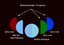
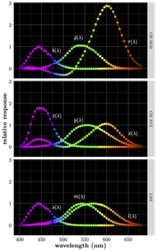
The CIE 1931 standard observer is derived from experiments in which participants observing a foveal 2° bipartite field with a dark surround. Half of the field is illuminated with a monochromatic test stimulus (ranging from 380 nm to 780 nm) and the other half is the matching stimulus illuminated with three coincident monochromatic primary lights: 700 nm for red (R), 546.1 nm for green (G), and 435.8 nm for blue (B).[64]: 29 These primaries correspond to CIE RGB color space. The intensities of the primary lights could be adjusted by the participant observer until the matching stimulus matched the test stimulus, as predicted by Grassman's laws of additive mixing. Different standard observers from other color matching experiments have been derived since 1931. The variations in experiments include choices of primary lights, field of view, number of participants etc.[65] but the presentation below is representative of those results.
Matching was performed across many participants in incremental steps along the range of test stimulus wavelengths (380 nm to 780 nm) to ultimately yield the color matching functions: , and that represent the relative intensities of red, green, and blue light to match each wavelength (). These functions imply that units of the test stimulus with any spectral power distribution, , can be matched by , , and units of each primary where:[64]: 28
| (Eq. 1) |
Each integral term in the above equation is known as a tristimulus value and measures amounts in the adopted units. No set of real primary lights can match another monochromatic light under additive mixing so at least one of the color matching functions is negative for each wavelength. A negative tristimulus value corresponds to that primary being added to the test stimulus instead of the matching stimulus to achieve a match.
The negative tristimulus values made certain types of calculations difficult, so the CIE put forth new color matching functions , , and defined by the following linear transformation:[64]: 30
| (Eq. 2) |
These new color matching functions correspond to imaginary primary lights X, Y, and Z (CIE XYZ color space). All colors can be matched by finding the amounts X, Y, and Z analogously to R, G, and B as defined in Eq. 1. The functions , , and based on the specifications that they should be nonnegative for all wavelengths, be equal to photometric luminance, and that for an equienergy (i.e., a uniform spectral power distribution) test stimulus.[64]: 30
Derivations use the color matching functions, along with data from other experiments, to ultimately yield the cone fundamentals: , and . These functions correspond to the response curves for the three types of color photoreceptors found in the human retina: long-wavelength (L), medium-wavelength (M), and short-wavelength (S) cones. The three cone fundamentals are related to the original color matching functions by the following linear transformation (specific to a 10° field):[64]: 227


